Respect the referral.
Visitors often arrived already aware of the firm. The page needed to validate that recommendation quickly.
Case 15 / Conversion-focused web design
A sprawling website became a focused, trustworthy landing page designed around the way referrals actually convert.

AVNI had an overbuilt website that did not reflect how the firm actually acquired clients. Most new business came through trusted referrals—not search traffic or a long content journey.
The extra pages, complexity, and maintenance created cost without making the next step clearer for prospective clients.
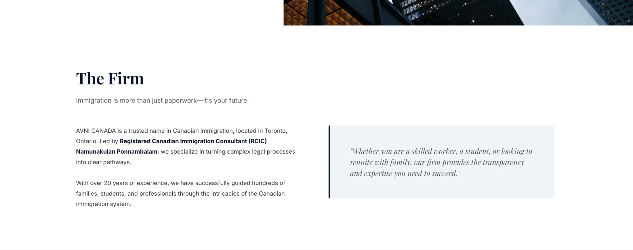
Visitors often arrived already aware of the firm. The page needed to validate that recommendation quickly.
Who they are, what they handle, and how to contact them were organized into one direct sequence.
Professional typography, calm spacing, credentials, and clear service language established trust without excess.
A simpler structure reduced unnecessary hosting, content, upkeep, and future maintenance demands.
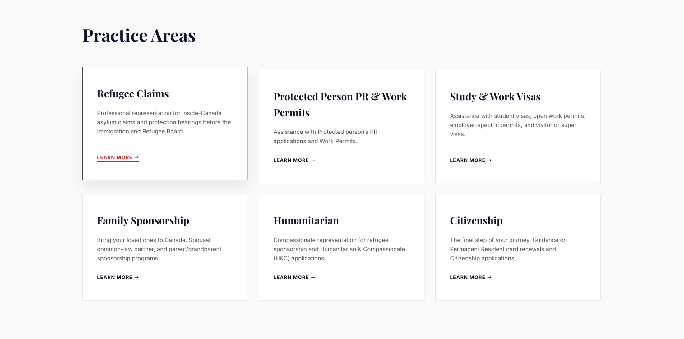
Service clarity
Practice areas were translated into a clear card system, allowing referred prospects to confirm fit without navigating a maze of individual pages.
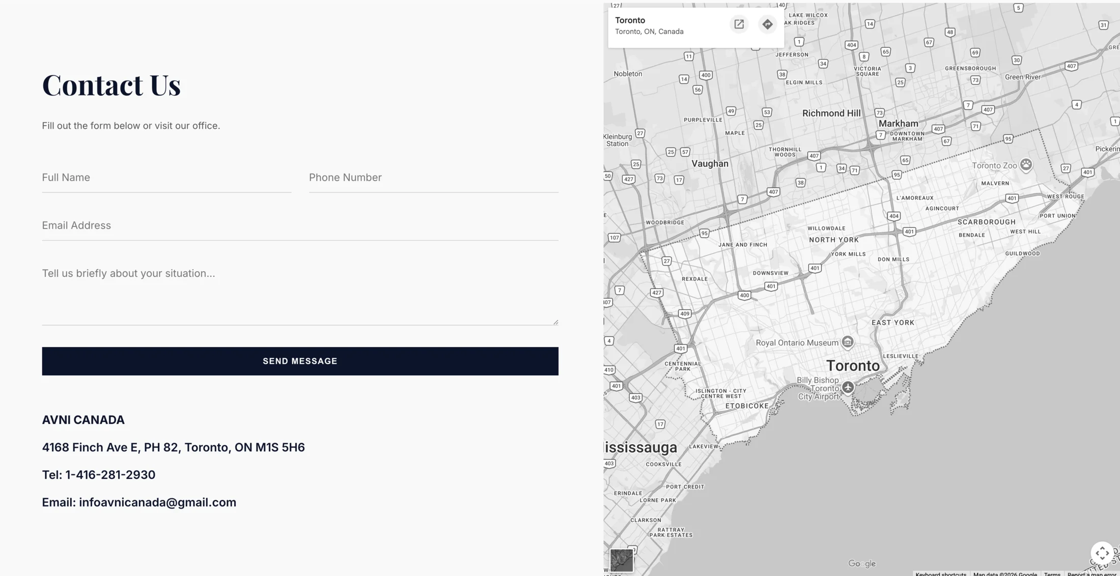
Conversion endpoint
The contact experience is visible, practical, and grounded in the firm’s Toronto presence. Visitors can move from referral validation to direct outreach without unnecessary friction.
View AVNI Canada live ↗Business-card website
The final site gives referred clients exactly what they need: confidence in the firm, a clear understanding of its services, and an immediate route to contact. AVNI gained a cleaner digital presence while reducing unnecessary costs and maintenance.